Responsive Tables with inner scrolling
|
When we looked around at the various implementations of responsive tables on the web, we saw lots of interesting ideas but nothing we thought was a really great implementation. Chris Coyier on css-tricks.net did a great round up of responsive data tables and while there’s some fascinating ideas in there, nothing seemed to meet the criteria we had for a great implementation:
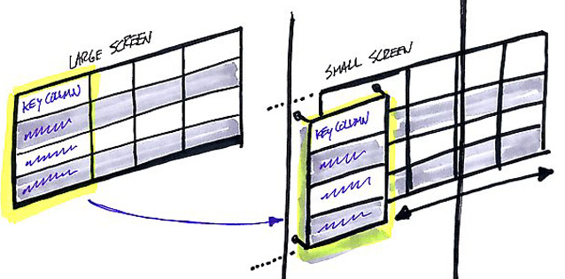
With those existing tricks in mind, we set out to develop this, a CSS/JS combo that takes existing tables and modifies them for small devices so they meet our criteria. It works by taking the first column and «pinning» it to the left of the table, allowing you to scroll the other columns under it. You don’t lose the likely key for each row, but you also don’t have to break your nice responsive layout. We built these specifically to work with Foundation, our open source front-end framework for responsive sites, but it would work just fine with any responsive site.
|


